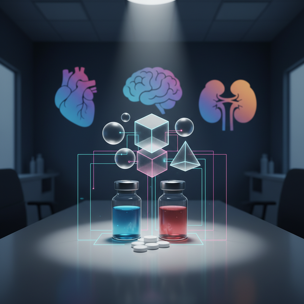
A digital-art conceptual image of drug–drug interaction analysis: two distinct medication vials and several tablets on a neutral clinical bench, with translucent, interlocking geometric shapes hovering above them, symbolizing overlapping mechanisms and interactions. Thin glowing lines connect the medicines to simplified organ silhouettes in the background—heart, brain, kidney—formed from soft gradients and smooth contours. The environment is a dimmed, modern clinical office with cool blue ambient light and a focused white spotlight on the central objects, creating gentle shadows and a sense of depth. Composed with a central focus and shallow depth-of-field effect, the atmosphere is serious yet clear, ideal for illustrating interaction checking and risk assessment.

比較・使い分け

薬剤・レジメン・支持療法を比較表で並べ、何が違いで、どの症例にどれを選ぶかという判断軸を整理するページです。費用、投与スケジュール、用量調整、併用制限など、実務で迷いやすい視点を一覧で確認し、必要に応じて個別記事や根拠文献へ深掘りできます。

表形式コンテンツ

薬効群別の比較表やプロコン一覧などをカード形式で整理し、画面サイズに応じて柔軟にレイアウトできるように設計します。スマートフォンでも横スクロールや折りたたみを使って、一目で選択肢の違いと実務ポイントを把握できる配置を目指します。

A digital-art cross-section scene of a modern clinical pharmacy verification station, featuring a dual-monitor setup displaying stylized graphs, drug interaction network diagrams, and simplified organ icons instead of text. On the desk, a few highlighted medication containers with distinct shapes and color bands represent different drug classes. Soft cool-white task lighting from an adjustable lamp illuminates the workstation, while the surrounding room fades into a subtle blue-gray blur. The composition uses a three-quarters angle, creating depth, with sharp focus on the screens and medications. The mood is focused and analytical, conveying evidence-based, point-of-care decision support for pharmacists and healthcare professionals.

比較の背景解説

表で示した薬剤やレジメンの違いについて、その背景となる臨床試験データやガイドライン、実臨床での使い分けのエビデンスを記事形式で詳しく解説します。単なるスペック比較にとどまらず、「なぜこの選択肢を選ぶのか」「どこに注意して処方・監査するか」を言語化し、比較表の理解を一段深めることを目的としています。